COMPARE: How European countries are faring against 'third wave' of Covid infections
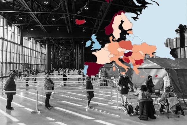
Some 12 months on from the first national lockdowns governments across Europe are once again ramping up restrictions to battle what some leaders are describing as a "third wave" of Covid-19 infections. This selection of charts gives a snapshot of the state of the pandemic across Europe.
More than 900,000 people have died of Covid-19 in Europe, according to a tally compiled by AFP on Tuesday.
The 41m confirmed cases seen across Europe rank it second only to The Americas (North and South America), which have recorded 53m cases, making it the worst hit of the World Health Organisation’s six regions, according to its Covid-19 dashboard.
The situation in some European countries has improved over the past month particularly Portugal, Ireland and the UK which were hit hard after Christmas. However other parts of Europe have seen a surge in infections particularly Italy and France, just as the countries marked a year since the first wave forced them into lockdown.
The charts below from Our World in Data shed some light on how the countries covered by The Local are currently faring in the battle against what some governments are calling "a third wave".
Daily new confirmed cases
The chart below shows a rolling seven-day average for new Covid-19 infections per million people.
The most dramatic change in the last month has been in Italy, where infection numbers have almost doubled since The Local’s last overview on 10th February.
Italy imposed tough new restrictions for much of the country on Monday, with any region with more than 250 cases per 100,000 inhabitants automatically placed in the highest-risk red zone.
The toughest measures include the obligation to justify any movements, including within your own municipality, school and non-essential shop closures, and a ban on home visits.
All the charts below are available in interactive form via Our World in Data.
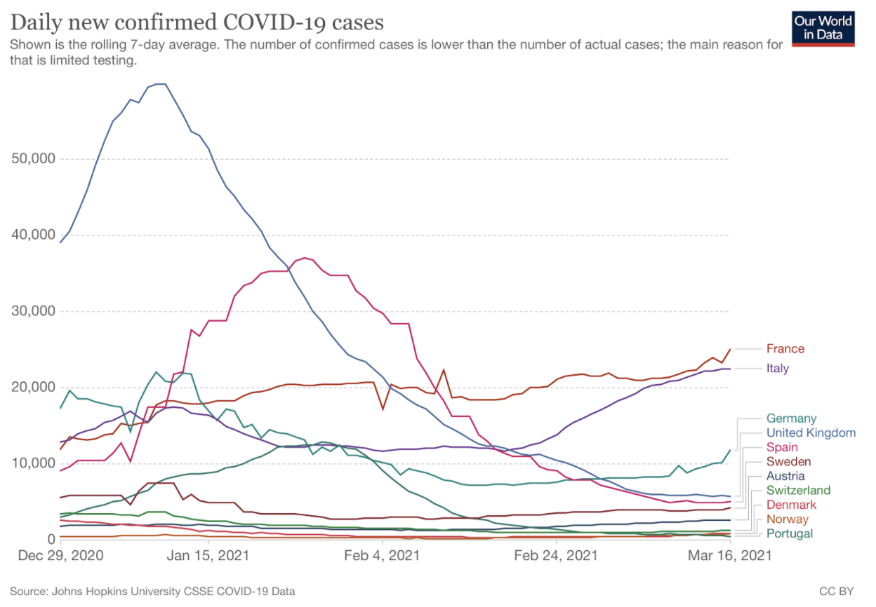
This is on top of the nationwide curfew, which remains in effect from 10pm to 5am.
Cases are also rising in France despite the country’s ongoing nationwide 6pm curfew and weekend lockdowns in parts of the Riviera and the north.
Restaurants, bars and other venues also remain closed.
However, it seems this is not enough to stem the rise of infections, which are putting increasing pressure on intensive care units. The French PM Jean Castex said France was "in a form of the third wave" of infections.
In a bid to turn this around, the government is expected to announce tighter restrictions, particularly for the Paris region and northern France on Thursday.
Infections per size of population
However, when you factor population size into the infection rate, you get a slightly different picture (see below chart).
The cases per capita in Italy and France are clearly still high, but they’re joined at the top of the chart by Sweden and Austria.
Infection rates have been steadily creeping up in Sweden in recent weeks but the country has up to now avoided imposing nationwide lockdowns preferring instead to issue "recommendations" over enforceable restrictions such as the wearing of face masks on public transport.
Everyone in Sweden is currently urged to stay at home and get a coronavirus test if they are at all sick (even a mild cough or sore throat), practise social distancing, work from home if possible, avoid public transport as much as possible, and socialise with as few people as possible.
However in recent weeks tighter measures have been taken with bars and restaurants now forced to close early. Travel bans are also in place aimed at preventing the spread of variants.
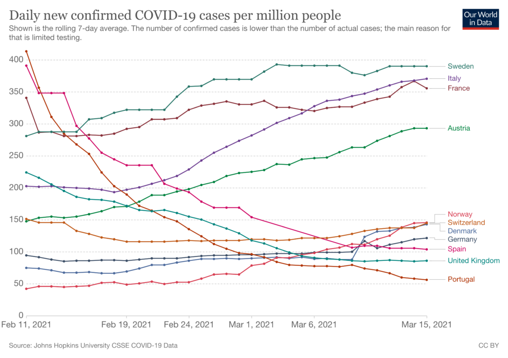
In Austria, meanwhile, the number of infections has been steadily climbing since lockdown measures were relaxed on 8th February, while available hospital beds have sharply declined.
Austria is set to decide this week whether lockdown restrictions will be further relaxed across the nation, but this seems unlikely given the latest case numbers.
In Switzerland, coronavirus infection numbers remained steady throughout March despite the country's coronavirus measures.
Switzerland is planning a next round of opening on March 22nd, including allowing restaurants with outdoor areas to open and permitting small events. A final decision on reopening will be made on Friday, March 19th.
Germany is also seeing infections rise once again as lockdown measures have begun to be eased. The rise has prompted certain states like Berlin to pause the easing of restrictions.
Germany's Robert Koch Institute released a prognosis last week that there would be more cases in early April than there were at the high point of the crisis in late December. The basis for this prognosis is the increased prevalence of the so-called British variant of the coronavirus which is believed to be more transmissible.
Fortunately, case numbers are still falling in some countries. The chart also highlights Portugal’s steady decrease in infections from its third-wave peak in January. The UK has also seen infections fall since a third lockdown was imposed in early January 2021.
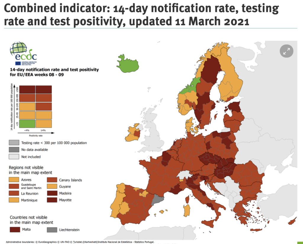
And the chart looks like this in map form, showing the comparatively high level of infection in Europe.

And this map (below) from The European Centre for Disease Prevention and Control gives a clear overview of wider regional hotspots in countries such as northern France and northern Italy.
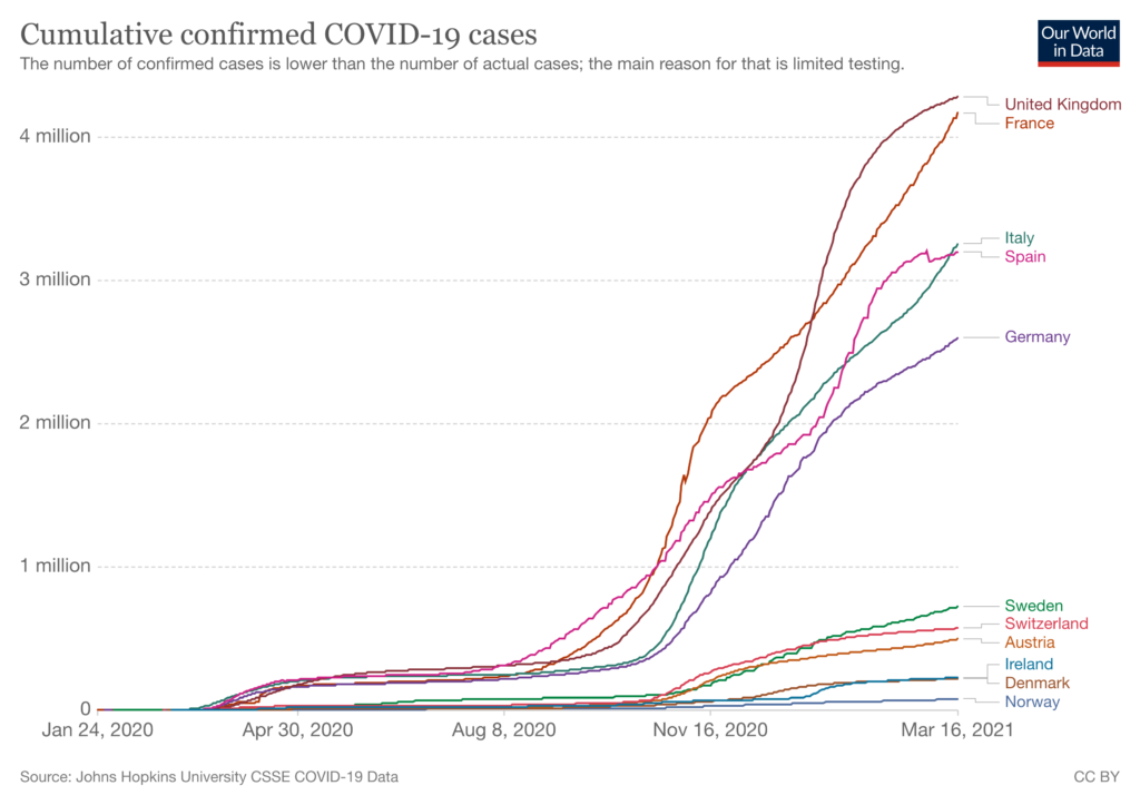
Cumulative confirmed infections
Since our last update on 10th February, Italy has overtaken Spain to become the country with the second-highest number of confirmed cumulative cases out of countries in The Local’s network.
However, France is still way out in the front in terms of confirmed cumulative cases, although it is just topped by the UK.
Much, however, depends on testing policies and capacity. In all countries, the number of confirmed cases is lower than actual cases due to limits in testing capabilities.
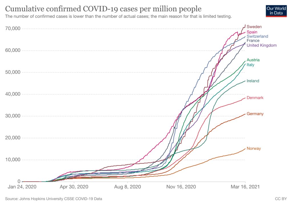
The chart below shows the cumulative number of confirmed cases when population is taken into account.
The change in infections over the last two weeks
The chart below shows the change in the number of confirmed infections over the last two weeks when compared with the prior 14-day period.
Countries that are coloured blue are those where the pandemic is receding; darker shades reflect a larger drop in infections.
Those in shades of red are where infections have increased over the last 14 days.
Here, you can clearly see the recent increase in the number of cases in every country covered by The Local, with infections growing particularly rapidly in Spain (despite tougher regional restrictions) and Norway.
Infections in the UK have declined due to the lockdown imposed on 6th January and some early effects from the rapid vaccination rollout.
However, with schools having returned on 8th March, it remains to be seen what impact this will have on new infections in the coming weeks.
The number of coronavirus infections in Denmark remains steady, more than two weeks after the country lifted some restrictions on March 1st. Since the beginning of this year, Denmark has maintained tight restrictions in order to slow the spread of the more infectious B117 variant
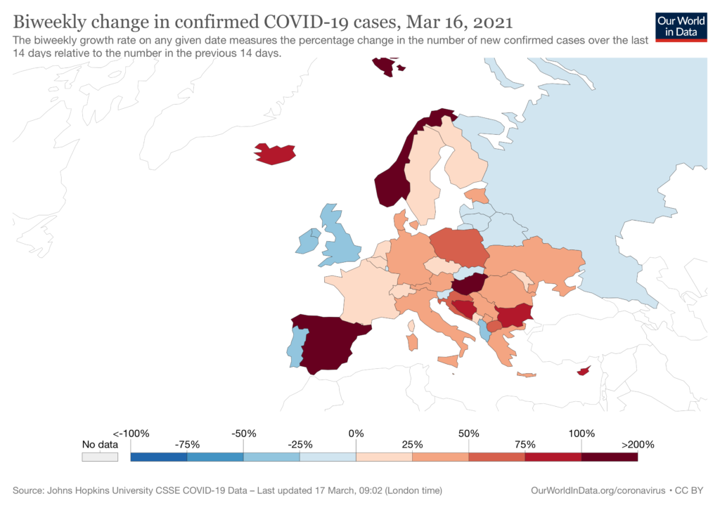
After infection rates in Switzerland declined steadily at the end of February, sparking hopes that it will drop below 1,000 infections a day, the number of coronavirus cases jumped in the past week, exceeding 1,400 on Thursday.
There are fears in the country of a third wave and the rise in cases is putting the planned March 22nd reopening of restaurants at risk.
Share of population who have received first dose of vaccine
A country’s current mark of "success" in fighting the pandemic is twofold: there’s the need to keep infections low, but also to vaccinate as many people as possible.
Here, Denmark remains ahead of the other countries covered by The Local’s network, with close to 15% of the population having received their first vaccine dose.
Perhaps unsurprisingly, given that all the countries are receiving their vaccines under the same EU programme, other European countries are grouped closely together.
Norway is close behind Denmark, with 14% of the population having had a first jab while France is now trailing the pack with 11%.
However, not all the countries are equally good at providing up-to-date data. The most recent data from Switzerland, for example, is around three days’ old.
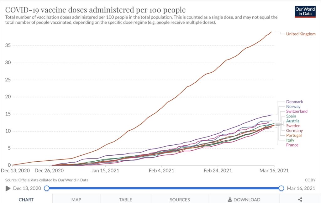
The UK continues to outpace the rest of Europe, with close to 40% of the population having had a first shot.
It has been able to forge ahead rapidly with its vaccination rollout as it is unfettered by the European Union’s collective buying programme. It also started administering jabs earlier than the other countries.
Furthermore, it decided to stretch out the period between doses, preferring to give as many people as possible a first dose.
Several European countries have currently suspended AstraZeneca vaccinations due to concerns over side-effects.
Average of daily deaths
This chart shows the countries currently suffering the highest death rates over the last seven days.
Deaths have fallen dramatically since The Local’s last overview in February despite many countries reporting an increase in new cases over the past month.
The UK no longer has more average daily deaths than other countries in Europe and has fallen back to fourth position, with an average of 145 deaths a day.
Italy, where new infections are also rising, now tops the board for this grim statistic.
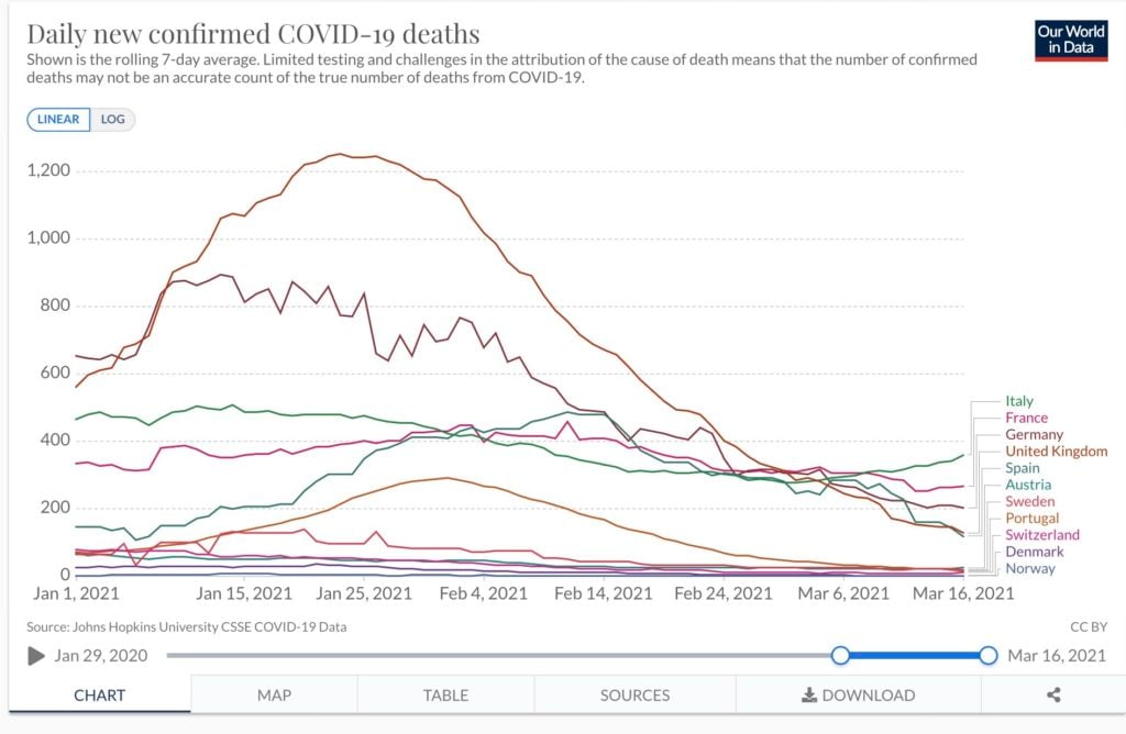
However, it should be noted that this is because other countries’ deaths have fallen off more sharply rather than because Italy has seen a huge increase in mortality rates.
Month-on-month, daily deaths in Italy are little changed as numbers declined at the end of February before edging higher again this month.
Daily new confirmed deaths currently stand at an average of 360 in the country.
The chart also highlights the extent to which death rates lag infection numbers. Despite most countries, including Sweden and Germany, seeing rising cases, this is yet to be reflected in the average daily deaths.
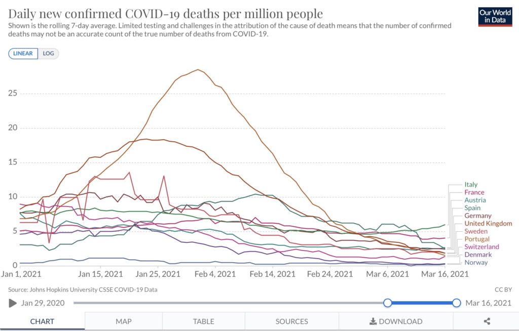
The following chart shows the daily death rate when population size is taken into account.
You can see from the chart that Italy’s per capita death rate is still the highest, but France is not far behind.
Spain’s per capita death rates have come down to converge with those of Austria and Germany, while those in Sweden remain below all three.
This chart also highlights just how lightly Norway is still being affected by the pandemic, with its per-capita death rate still far below that of other European countries.
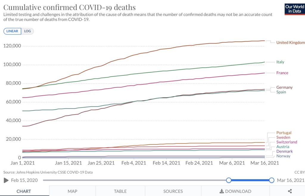
Total deaths linked to Covid-19
This chart shows the countries with the highest death tolls linked to the Covid-19 virus. However, as the chart notes, testing and different ways of attributing the cause of death means the number of confirmed deaths may not be an accurate account of the true number of deaths from Covid-19.
As you can see from the chart, after rising sharply in January, the death curve has been flattening in most countries.
The UK is still recording the most deaths overall. However, the mortality rate has slowed, with the country recording some 10,700 deaths in a month compared to 30,000 a month earlier when The Local did its last overview.
Also striking is the relatively large number of deaths in Sweden, now at over 13,000, compared to its Nordic neighbours Denmark and Norway.
Taken together, the two countries, which have a combined population similar to that of Sweden, have seen less than a quarter as many deaths.
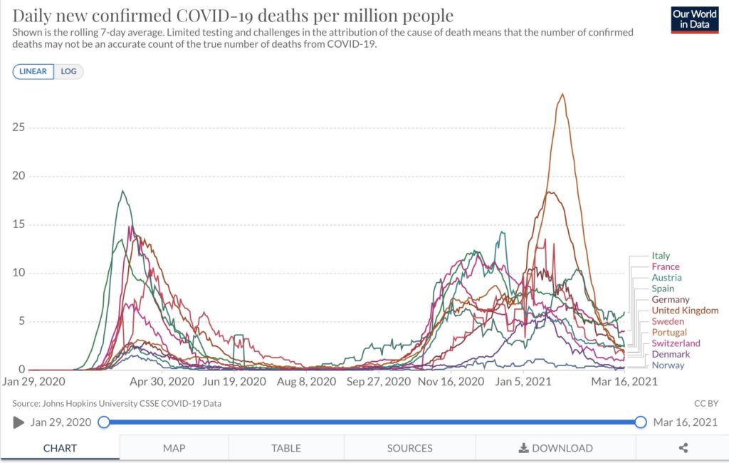
The following chart looks at death rates during the first, second or third waves based on size of population.
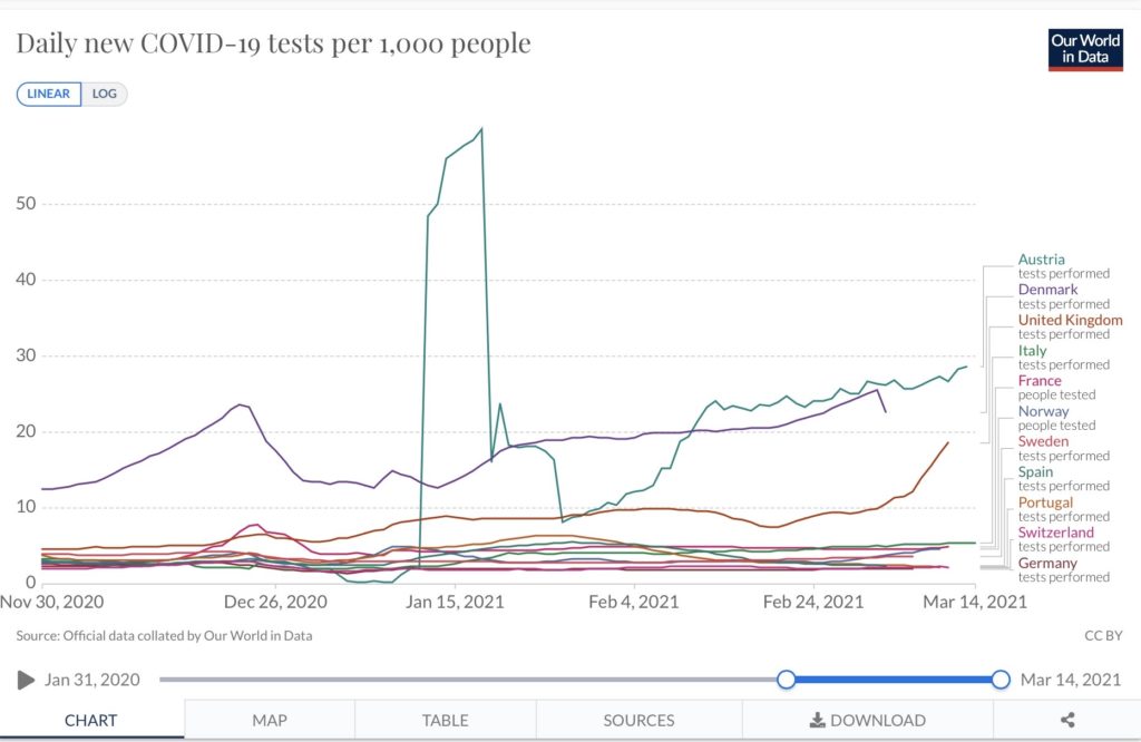
Testing rates
This chart looks at how different countries square up when it comes to testing their populations for Covid-19.
Here, you can see the enormous surge in testing Austria achieved in January, despite it shelving its compulsory mass testing programme. Rates fell off to the end of the month but have been steadily climbing again.
Aside from Austria, Denmark remains far ahead of other countries based on the number of tests carried out per thousand people.
You can see a spike before Christmas when Danes got themselves tested so they could more safely see relatives.
Testing rates are fairly flat across the other countries covered by The Local with only the UK seeing the number of daily tests pick up over the past month.
All the charts above are available in interactive form via Our World in Data.
Comments
See Also
More than 900,000 people have died of Covid-19 in Europe, according to a tally compiled by AFP on Tuesday.
The 41m confirmed cases seen across Europe rank it second only to The Americas (North and South America), which have recorded 53m cases, making it the worst hit of the World Health Organisation’s six regions, according to its Covid-19 dashboard.
The situation in some European countries has improved over the past month particularly Portugal, Ireland and the UK which were hit hard after Christmas. However other parts of Europe have seen a surge in infections particularly Italy and France, just as the countries marked a year since the first wave forced them into lockdown.
The charts below from Our World in Data shed some light on how the countries covered by The Local are currently faring in the battle against what some governments are calling "a third wave".
Daily new confirmed cases
The chart below shows a rolling seven-day average for new Covid-19 infections per million people.
The most dramatic change in the last month has been in Italy, where infection numbers have almost doubled since The Local’s last overview on 10th February.
Italy imposed tough new restrictions for much of the country on Monday, with any region with more than 250 cases per 100,000 inhabitants automatically placed in the highest-risk red zone.
The toughest measures include the obligation to justify any movements, including within your own municipality, school and non-essential shop closures, and a ban on home visits.
All the charts below are available in interactive form via Our World in Data.
This is on top of the nationwide curfew, which remains in effect from 10pm to 5am.
Cases are also rising in France despite the country’s ongoing nationwide 6pm curfew and weekend lockdowns in parts of the Riviera and the north.
Restaurants, bars and other venues also remain closed.
However, it seems this is not enough to stem the rise of infections, which are putting increasing pressure on intensive care units. The French PM Jean Castex said France was "in a form of the third wave" of infections.
In a bid to turn this around, the government is expected to announce tighter restrictions, particularly for the Paris region and northern France on Thursday.
Infections per size of population
However, when you factor population size into the infection rate, you get a slightly different picture (see below chart).
The cases per capita in Italy and France are clearly still high, but they’re joined at the top of the chart by Sweden and Austria.
Infection rates have been steadily creeping up in Sweden in recent weeks but the country has up to now avoided imposing nationwide lockdowns preferring instead to issue "recommendations" over enforceable restrictions such as the wearing of face masks on public transport.
Everyone in Sweden is currently urged to stay at home and get a coronavirus test if they are at all sick (even a mild cough or sore throat), practise social distancing, work from home if possible, avoid public transport as much as possible, and socialise with as few people as possible.
However in recent weeks tighter measures have been taken with bars and restaurants now forced to close early. Travel bans are also in place aimed at preventing the spread of variants.
In Austria, meanwhile, the number of infections has been steadily climbing since lockdown measures were relaxed on 8th February, while available hospital beds have sharply declined.
Austria is set to decide this week whether lockdown restrictions will be further relaxed across the nation, but this seems unlikely given the latest case numbers.
In Switzerland, coronavirus infection numbers remained steady throughout March despite the country's coronavirus measures.
Switzerland is planning a next round of opening on March 22nd, including allowing restaurants with outdoor areas to open and permitting small events. A final decision on reopening will be made on Friday, March 19th.
Germany is also seeing infections rise once again as lockdown measures have begun to be eased. The rise has prompted certain states like Berlin to pause the easing of restrictions.
Germany's Robert Koch Institute released a prognosis last week that there would be more cases in early April than there were at the high point of the crisis in late December. The basis for this prognosis is the increased prevalence of the so-called British variant of the coronavirus which is believed to be more transmissible.
Fortunately, case numbers are still falling in some countries. The chart also highlights Portugal’s steady decrease in infections from its third-wave peak in January. The UK has also seen infections fall since a third lockdown was imposed in early January 2021.
And the chart looks like this in map form, showing the comparatively high level of infection in Europe.
And this map (below) from The European Centre for Disease Prevention and Control gives a clear overview of wider regional hotspots in countries such as northern France and northern Italy.
Cumulative confirmed infections
Since our last update on 10th February, Italy has overtaken Spain to become the country with the second-highest number of confirmed cumulative cases out of countries in The Local’s network.
However, France is still way out in the front in terms of confirmed cumulative cases, although it is just topped by the UK.
Much, however, depends on testing policies and capacity. In all countries, the number of confirmed cases is lower than actual cases due to limits in testing capabilities.
The chart below shows the cumulative number of confirmed cases when population is taken into account.
The change in infections over the last two weeks
The chart below shows the change in the number of confirmed infections over the last two weeks when compared with the prior 14-day period.
Countries that are coloured blue are those where the pandemic is receding; darker shades reflect a larger drop in infections.
Those in shades of red are where infections have increased over the last 14 days.
Here, you can clearly see the recent increase in the number of cases in every country covered by The Local, with infections growing particularly rapidly in Spain (despite tougher regional restrictions) and Norway.
Infections in the UK have declined due to the lockdown imposed on 6th January and some early effects from the rapid vaccination rollout.
However, with schools having returned on 8th March, it remains to be seen what impact this will have on new infections in the coming weeks.
The number of coronavirus infections in Denmark remains steady, more than two weeks after the country lifted some restrictions on March 1st. Since the beginning of this year, Denmark has maintained tight restrictions in order to slow the spread of the more infectious B117 variant
After infection rates in Switzerland declined steadily at the end of February, sparking hopes that it will drop below 1,000 infections a day, the number of coronavirus cases jumped in the past week, exceeding 1,400 on Thursday.
There are fears in the country of a third wave and the rise in cases is putting the planned March 22nd reopening of restaurants at risk.
Share of population who have received first dose of vaccine
A country’s current mark of "success" in fighting the pandemic is twofold: there’s the need to keep infections low, but also to vaccinate as many people as possible.
Here, Denmark remains ahead of the other countries covered by The Local’s network, with close to 15% of the population having received their first vaccine dose.
Perhaps unsurprisingly, given that all the countries are receiving their vaccines under the same EU programme, other European countries are grouped closely together.
Norway is close behind Denmark, with 14% of the population having had a first jab while France is now trailing the pack with 11%.
However, not all the countries are equally good at providing up-to-date data. The most recent data from Switzerland, for example, is around three days’ old.
The UK continues to outpace the rest of Europe, with close to 40% of the population having had a first shot.
It has been able to forge ahead rapidly with its vaccination rollout as it is unfettered by the European Union’s collective buying programme. It also started administering jabs earlier than the other countries.
Furthermore, it decided to stretch out the period between doses, preferring to give as many people as possible a first dose.
Several European countries have currently suspended AstraZeneca vaccinations due to concerns over side-effects.
Average of daily deaths
This chart shows the countries currently suffering the highest death rates over the last seven days.
Deaths have fallen dramatically since The Local’s last overview in February despite many countries reporting an increase in new cases over the past month.
The UK no longer has more average daily deaths than other countries in Europe and has fallen back to fourth position, with an average of 145 deaths a day.
Italy, where new infections are also rising, now tops the board for this grim statistic.
However, it should be noted that this is because other countries’ deaths have fallen off more sharply rather than because Italy has seen a huge increase in mortality rates.
Month-on-month, daily deaths in Italy are little changed as numbers declined at the end of February before edging higher again this month.
Daily new confirmed deaths currently stand at an average of 360 in the country.
The chart also highlights the extent to which death rates lag infection numbers. Despite most countries, including Sweden and Germany, seeing rising cases, this is yet to be reflected in the average daily deaths.
The following chart shows the daily death rate when population size is taken into account.
You can see from the chart that Italy’s per capita death rate is still the highest, but France is not far behind.
Spain’s per capita death rates have come down to converge with those of Austria and Germany, while those in Sweden remain below all three.
This chart also highlights just how lightly Norway is still being affected by the pandemic, with its per-capita death rate still far below that of other European countries.
Total deaths linked to Covid-19
This chart shows the countries with the highest death tolls linked to the Covid-19 virus. However, as the chart notes, testing and different ways of attributing the cause of death means the number of confirmed deaths may not be an accurate account of the true number of deaths from Covid-19.
As you can see from the chart, after rising sharply in January, the death curve has been flattening in most countries.
The UK is still recording the most deaths overall. However, the mortality rate has slowed, with the country recording some 10,700 deaths in a month compared to 30,000 a month earlier when The Local did its last overview.
Also striking is the relatively large number of deaths in Sweden, now at over 13,000, compared to its Nordic neighbours Denmark and Norway.
Taken together, the two countries, which have a combined population similar to that of Sweden, have seen less than a quarter as many deaths.
The following chart looks at death rates during the first, second or third waves based on size of population.
Testing rates
This chart looks at how different countries square up when it comes to testing their populations for Covid-19.
Here, you can see the enormous surge in testing Austria achieved in January, despite it shelving its compulsory mass testing programme. Rates fell off to the end of the month but have been steadily climbing again.
Aside from Austria, Denmark remains far ahead of other countries based on the number of tests carried out per thousand people.
You can see a spike before Christmas when Danes got themselves tested so they could more safely see relatives.
Testing rates are fairly flat across the other countries covered by The Local with only the UK seeing the number of daily tests pick up over the past month.
All the charts above are available in interactive form via Our World in Data.
Join the conversation in our comments section below. Share your own views and experience and if you have a question or suggestion for our journalists then email us at [email protected].
Please keep comments civil, constructive and on topic – and make sure to read our terms of use before getting involved.
Please log in here to leave a comment.