MAPS: Which parts of Italy have the fewest coronavirus cases?

As the spread of coronavirus continues to slow across Italy, here are four maps showing how the situation varies from one region and province to another.
Another 2086 cases of coronavirus were confirmed in Italy on Wednesday, meaning there have now been 203,591 cases in total since the outbreak began - including patients who have died or recovered.
There are currently 104,657 people known to be infected with COVID-19 in Italy according to government statistics.
But while every part of Italy has been hit by the outbreak, some regions are affected far more severely than others.
In fact, just four regions accounted for around 75 percent of yesterday's new cases, while two regions reported no new cases at all.
The worst-hit regions were Lombardy with 786 new cases, Piedmont with 411, Emilia-Romagna with 283, and Veneto and Liguria had 117 new cases each. After that came Lazio with 78 cases and Tuscany, which reported 61.
Meanwhile the sparsely-populated, rural regions of Molise and Baslicata reported no new cases on Wednesday, not for the first time.
READ ALSO:
Calabria and Sardinia reported five new cases each.
The daily figures released by the Department of Civil Protection continually show higher rates of new infections in most northern and central-northern regions, and lower rates across the south.
There are exceptions. For example, the Valle d'Aosta region, bordering Switzerland, has reported consistently lower figures than neighbouring regions in the north-west of Italy, and had only five new cases on Wednesday.
You can see the daily figures from Italy, with the increase for each region, here.
This map shows the total number of cases by region since the outbreak began.
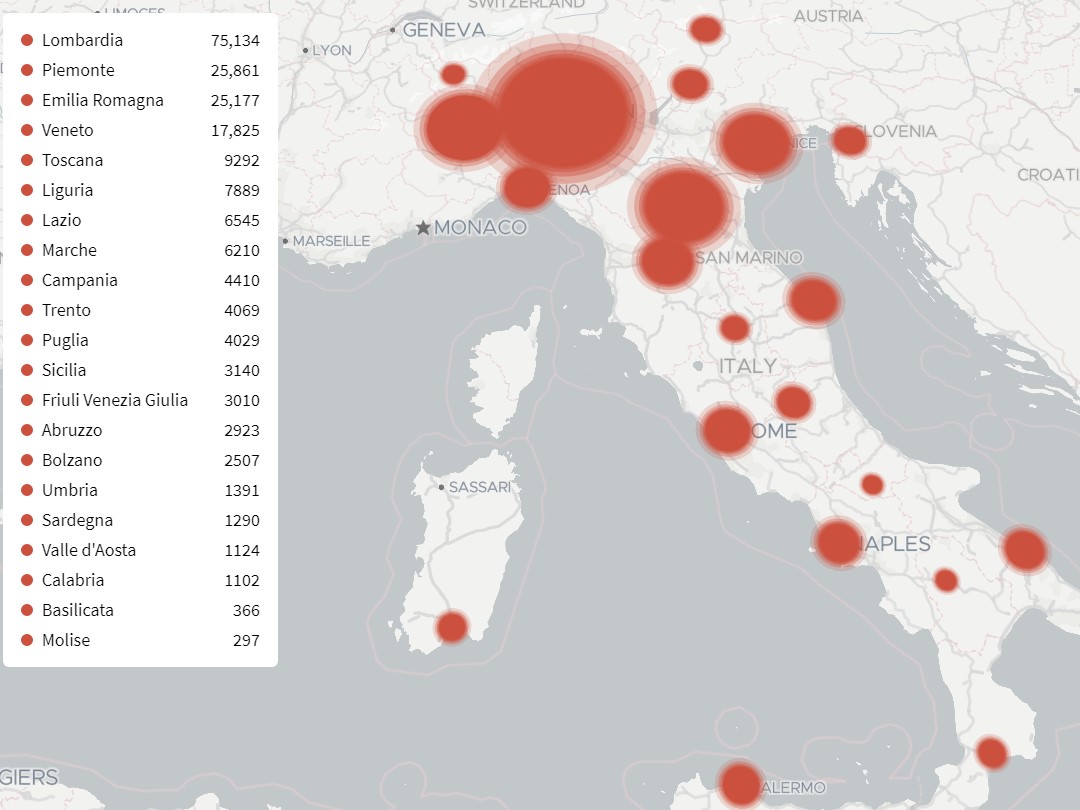
Data visualisation by Gedi Digital.
There are also large differences within regions. The map below breaks down the total figure by province
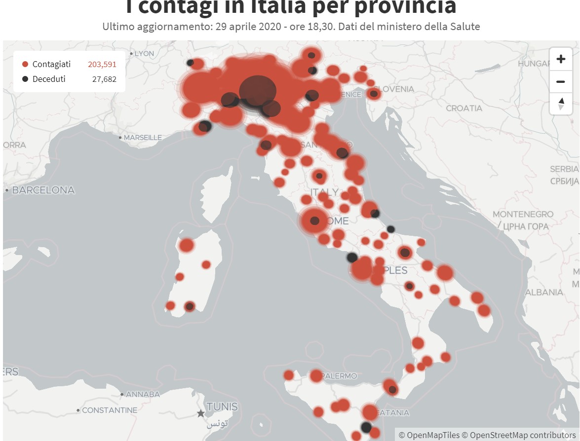
Data visualisation by Gedi Digital.
Below is another map looking at the figures by province.
This one gives the change in the number of cases on Wednesday compared to Tuesday by province, shown as a percentage.
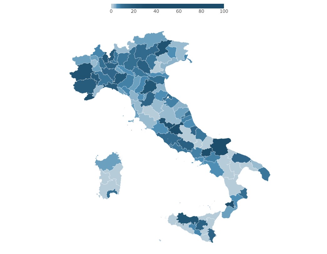
Data visualisation by Gedi Digital.
And this map aims to show the "incidence of contagion" across Italy, or how many healthy people there are for each coronavirus patient. The darker red the area, the higher proportion of the population is currently sick.
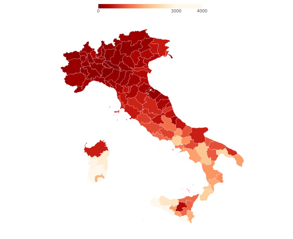
Data visualisation by Gedi Digital.
Comments
See Also
Another 2086 cases of coronavirus were confirmed in Italy on Wednesday, meaning there have now been 203,591 cases in total since the outbreak began - including patients who have died or recovered.
There are currently 104,657 people known to be infected with COVID-19 in Italy according to government statistics.
But while every part of Italy has been hit by the outbreak, some regions are affected far more severely than others.
In fact, just four regions accounted for around 75 percent of yesterday's new cases, while two regions reported no new cases at all.
The worst-hit regions were Lombardy with 786 new cases, Piedmont with 411, Emilia-Romagna with 283, and Veneto and Liguria had 117 new cases each. After that came Lazio with 78 cases and Tuscany, which reported 61.
Meanwhile the sparsely-populated, rural regions of Molise and Baslicata reported no new cases on Wednesday, not for the first time.
READ ALSO:
Calabria and Sardinia reported five new cases each.
The daily figures released by the Department of Civil Protection continually show higher rates of new infections in most northern and central-northern regions, and lower rates across the south.
There are exceptions. For example, the Valle d'Aosta region, bordering Switzerland, has reported consistently lower figures than neighbouring regions in the north-west of Italy, and had only five new cases on Wednesday.
You can see the daily figures from Italy, with the increase for each region, here.
This map shows the total number of cases by region since the outbreak began.
Data visualisation by Gedi Digital.
There are also large differences within regions. The map below breaks down the total figure by province
Data visualisation by Gedi Digital.
Below is another map looking at the figures by province.
This one gives the change in the number of cases on Wednesday compared to Tuesday by province, shown as a percentage.
Data visualisation by Gedi Digital.
And this map aims to show the "incidence of contagion" across Italy, or how many healthy people there are for each coronavirus patient. The darker red the area, the higher proportion of the population is currently sick.
Data visualisation by Gedi Digital.
Join the conversation in our comments section below. Share your own views and experience and if you have a question or suggestion for our journalists then email us at [email protected].
Please keep comments civil, constructive and on topic – and make sure to read our terms of use before getting involved.
Please log in here to leave a comment.